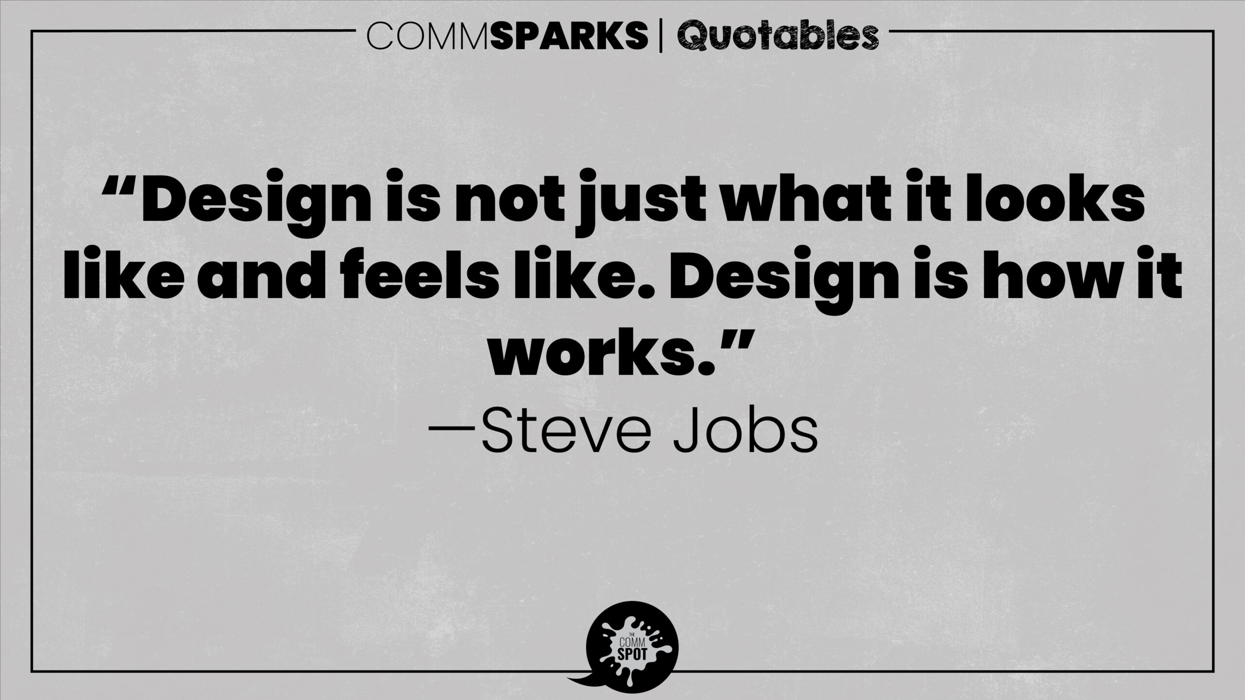
This principle shifts attention from aesthetics to function. Design is not primarily decoration; it is a system that shapes understanding and action. A layout, interface, chart, or document can look polished and still fail if people can’t find what they need, interpret what they see, or complete the task. “How it works” includes usability (ease of navigation), legibility (readability and clarity), hierarchy (what stands out and why), and affordances (what elements suggest people should do next). In other words, design is experienced as behavior and outcome, not merely appearance.
Aesthetic choices still matter, but they should serve function. Color should encode meaning; spacing should reduce cognitive load; typography should support scanning and comprehension. When form is separated from purpose, design becomes ornamental and often misleading—especially in data visualization, where visual decisions shape interpretation. The standard is performance: can someone quickly understand, decide, and act with minimal friction?
Applying this principle also requires testing design with real users. Preferences are subjective, but usability is observable. If users get lost, misread, or ignore what matters, the design isn’t working—regardless of how good it looks in a portfolio.
General application:
- Evaluate design by task success and comprehension, not by taste.
- Treat hierarchy, spacing, type, and color as meaning-making tools.
- Test with real users and revise based on observed friction.