
This page contains Amazon affiliate links, which means we may earn a small commission at no additional cost to you if you make a purchase through those links.
Who Is Edward Tufte?

Edward Tufte is an American statistician and information design theorist best known for shaping how we think about data visualization as a tool for reasoning, not decoration. Trained at Stanford and Yale, where he later taught, Tufte became influential for his critique of misleading and overly ornamental graphics.
Through landmark books such as The Visual Display of Quantitative Information, Tufte introduced foundational concepts including data-ink ratio, chartjunk, graphical integrity, and small multiples. His work provided a clear vocabulary and set of standards for evaluating whether visualizations clarify evidence or distort it.
Tufte’s central contribution is his insistence that data visualization is both an analytical and ethical practice. He argued that charts shape how people think and make decisions, and therefore must represent data honestly, clearly, and in ways that encourage meaningful comparison and understanding.
Further Reading: Edward Tufte’s Books
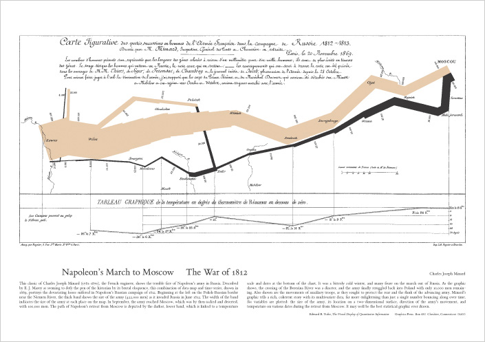
The Visual Display of Quantitative Information (1983)
Tufte’s foundational text on statistical graphics. Introduces core ideas like data-ink ratio, chartjunk, graphical integrity, and design strategies for making comparisons clear and honest. It’s the most widely cited entry point for his philosophy.
Envisioning Information (1990)
Broadens the scope beyond standard charts into complex information displays: maps, multi-layered diagrams, and dense evidence presentations. A major theme is how to show multivariate, layered information while preserving clarity.
Visual Explanations (1997)
Focuses on explanation, causality, and narrative in visual reasoning. Explores how visual displays can clarify processes, support causal claims, and also fail—showing how poor visual reasoning can contribute to real-world misunderstandings.
Beautiful Evidence (2006)
A later synthesis emphasizing evidence-based design, analytical depth, and integration of words, numbers, and pictures. It pushes beyond “how to make charts” toward how to present arguments with evidence in a visually coherent way.
Tufte’s Principles: Overview
Edward Tufte’s work is less about “making charts look nice” and more about helping people think clearly with evidence. In his view, the best visualizations are not ornaments or dashboards full of effects—they’re reasoning devices: tools that let viewers compare values, notice patterns, understand uncertainty, and draw warranted conclusions.
Across his books, Tufte returns to three big themes:
- Graphical Excellence: charts should be information-rich and worth reading closely.
- Graphical Integrity: charts must represent quantities honestly and proportionally.
- Analytical Design: charts should support serious analysis—comparisons, multivariate thinking, and layered detail.
What follows is a practical, deeper guide to those ideas. For each principle you’ll find: what it is, why it matters, and how to implement it (including common pitfalls and concrete practices).
1) Graphical Excellence
Graphical excellence is about making visualizations that are useful, clear, and dense with meaning. Tufte’s ideal is a graphic that rewards attention: the viewer can scan it quickly for the gist, then keep looking and keep learning.
Principle: Above all else, show the data
What it is
A visualization is successful when the viewer can see the data clearly and interpret it with minimal friction. “Showing the data” doesn’t mean dumping numbers onto the screen—it means designing so the data is the most visually prominent element, and everything else supports interpretation.
Why it matters
People often remember the look of a chart more than its values. If the design emphasizes decoration (a heavy frame, dramatic colors, large icons, 3D effects), the viewer’s attention is spent on style rather than evidence. In applied contexts—research briefs, policy reporting, strategic comm, journalism—this can produce misunderstanding or overconfidence in the wrong takeaway.
How to implement it in practice
- Start with the analytical question, not the chart type. (What decision or inference must the viewer make?)
- Make data marks the first thing the eye lands on. Use restrained styling for axes, gridlines, and labels.
- Prefer direct labeling (labels near lines/bars) over legends that force eye-travel and memory.
- Use annotation as “evidence guidance,” not narration. Short notes pointing to key changes (“recession begins,” “policy implemented,” “method changed”) help the viewer interpret without clutter.
- Design for reading, not impressing. If a design choice doesn’t help a viewer decode values, compare groups, or understand context, it’s suspect.
Common failure modes
- A chart where the background, gradients, or category colors dominate more than the data.
- A chart that requires the viewer to repeatedly bounce between legend and plot to decode basic meaning.
- A chart whose typography is larger than the data marks, turning the graphic into a poster rather than evidence.
Principle: Maximize the data-ink ratio
What it is
The data-ink ratio is the share of visual elements that directly represent data, relative to everything else (frames, decoration, heavy gridlines, unnecessary symbols, redundant labels). Tufte’s recommendation is to increase the proportion of “ink” devoted to data.
Why it matters
Every extra visual element adds cognitive load. Viewers must decide whether each mark matters, which slows comprehension and increases the chance they’ll miss what is important. In addition, heavy non-data elements can visually compete with the data, making small differences harder to see.
How to implement it in practice
- Audit your chart layer by layer. Ask of each element: Is this encoding data, or helping interpret it? If neither, remove it.
- Lighten supportive elements.
- Use subtle gridlines (or fewer of them).
- Thin axis strokes.
- Minimal tick marks.
- Avoid redundant labeling.
- Don’t label every tick if a few landmarks suffice.
- Don’t repeat units in multiple places.
- Use whitespace intentionally. Whitespace is not wasted; it improves legibility and makes patterns easier to detect.
Common failure modes
- Thick, dark gridlines that become the most salient feature.
- Over-labeled axes that turn the chart into a dense spreadsheet.
- Decorative panel backgrounds and borders that don’t aid interpretation.
Principle: Erase chartjunk
What it is
Chartjunk is anything that is visually loud but informationally quiet: 3D effects, drop shadows, glossy gradients, clip art, pictograms, textures, and ornamental shapes that do not encode data.
Why it matters
Chartjunk isn’t just “ugly”—it can actively distort meaning. 3D perspective changes perceived lengths; gradients create false emphasis; pictograms encourage counting shapes instead of comparing magnitudes. Viewers end up responding to the illustration rather than the measurement.
How to implement it in practice
- Ban 3D for quantitative charts. Perspective is a distortion engine.
- Replace pictograms with simple marks. If you need friendliness, use typography, whitespace, and clear annotation—not a row of tiny icons.
- Use color as a data tool.
- Highlight one series or one key category.
- De-emphasize everything else.
- Avoid rainbow palettes unless encoding ordered magnitude carefully (and even then, use caution).
- If you want “visual interest,” make the data interesting. The pattern, comparison, or story should create engagement—not visual effects.
Common failure modes
- “Dashboard glitter”: multiple shadows, gradients, and decorative boxes that read as importance.
- “Infographic style” applied to numeric comparisons—pretty but less truthful.
Principle: Encourage comparisons (comparison is the heart of reasoning)
What it is
Tufte emphasizes that viewers understand data by comparing it: before vs. after, group vs. group, trend vs. baseline, distribution vs. distribution. A good visualization makes comparisons easy, immediate, and fair.
Why it matters
Without explicit supports for comparison, viewers guess. They might compare across different scales, different baselines, or separated charts. This invites misinterpretation—especially when differences are small or when the audience is scanning quickly.
How to implement it in practice
- Use common scales when comparing categories across charts (avoid separate axis ranges unless clearly justified and labeled).
- Prefer small multiples (same chart repeated across categories with consistent scales) to cramming everything into one overloaded plot.
- Align baselines and categories so the eye can compare position/length directly.
- Provide reference lines or bands (targets, averages, “normal range,” historical baselines) that anchor interpretation.
- Show both absolute and relative change when it matters (e.g., both dollars and percent change), but do so with clean structure.
Common failure modes
- Two charts meant to be compared but shown with different axis ranges.
- Categories ordered alphabetically instead of analytically (e.g., not by magnitude, chronology, or meaningful grouping).
- Stacked charts used when the goal is to compare subcomponents across categories (stacking makes that hard).
2) Graphical Integrity
Graphical integrity is about ethical representation. The central claim is simple: if a chart makes a quantitative claim, it must represent that quantity proportionally, transparently, and without distortion. This isn’t only a moral issue—it’s a credibility issue. Once integrity is questioned, the entire message collapses.
Principle: Represent numbers proportionally (graphical measures should match numerical measures)
What it is
The visual magnitude (length, position, area) should correspond to the numerical magnitude. If a value doubles, the viewer should perceive “about double” visually—not 1.5×, not 4×.
Why it matters
Humans read visual magnitude quickly and often unconsciously. Small distortions can produce big interpretive errors—especially in persuasive contexts like PR, policy communication, investor reporting, or public health messaging.
How to implement it in practice
- Use appropriate encodings.
- For precise comparisons, position on a common scale (dot plots, line charts) is typically strongest.
- Length (bars) is usually good when baselines are consistent.
- Use area (bubbles) cautiously; people misjudge area more than length.
- Check axis logic.
- Bar charts typically require a zero baseline; otherwise lengths lie.
- If you must truncate, clearly signal it and explain why (e.g., focusing on variation around a stable level).
- Avoid dual axes unless you’re very careful. They can imply relationships that disappear when scales change.
Common failure modes
- Using circle area to represent values when viewers interpret diameter.
- Truncating bar chart baselines so small differences look enormous.
- Mixing units or scales without explicit labeling.
Principle: Do not lie with graphics (avoid distortion, omission, and rhetorical tricks)
What it is
A truthful visualization avoids misleading scale choices, selective framing, and hidden uncertainty. It should not imply more precision, certainty, or causality than the data supports.
Why it matters
Graphics are persuasive. People often treat charts as “objective.” That perceived objectivity makes misleading charts especially dangerous—they can shape decisions and beliefs with disproportionate force.
How to implement it in practice
- Expose uncertainty when it matters.
- Include confidence intervals, ranges, or error bars when estimates are uncertain.
- Clarify sample sizes and data limitations in a note.
- Avoid cherry-picked time windows.
- If showing a trend, ask: What happens if the time range expands?
- If the range is intentionally narrow, justify it.
- Separate correlation from causation.
- If the chart shows two lines moving together, label it as association unless causal evidence exists.
- Be explicit about data transformations.
- Log scales, index baselines (e.g., “Jan 2020 = 100”), smoothing, or rolling averages must be disclosed.
Common failure modes
- A smoothed line that hides volatility without disclosure.
- A dramatic narrative built from a carefully chosen start date.
- A chart that treats estimates as exact counts.
Principle: Show the data’s context (context prevents misreading)
What it is
A chart should provide enough surrounding information for the viewer to interpret meaningfully: comparisons, baselines, definitions, and relevant conditions.
Why it matters
Numbers are not self-interpreting. Context answers the viewer’s natural questions:
- “Compared to what?”
- “Is this high or low?”
- “Is this typical or unusual?”
- “What changed in the environment?”
How to implement it in practice
- Include benchmarks (targets, historical averages, peer groups).
- Define terms (what counts as “engagement,” “active user,” “incident,” “conversion”?).
- Annotate structural breaks (method changes, policy shifts, data collection changes, external shocks).
- Show distributions when averages mislead.
- If a mean hides inequality or bimodality, use a distribution plot, not a single summary.
Common failure modes
- Reporting a percent without the base rate or denominator.
- Showing a mean when the distribution is skewed or multi-peaked.
- Omitting relevant peer comparisons that would change interpretation.
3) Analytical Design
Analytical design is where Tufte becomes most “research-minded.” He argues that strong graphics should help people discover, not just “consume.” They should handle complexity without becoming confusing, and they should encourage deeper inspection.
Principle: Display many variables at once (multivariate thinking)
What it is
Many important questions require more than one variable: time + category + magnitude + uncertainty + context. Tufte values designs that can show complexity without collapsing it into oversimplified summaries.
Why it matters
Oversimplification can be a kind of distortion: it hides variation, masks subgroups, and creates false confidence. Multivariate displays allow viewers to see interactions: “this trend is true overall, but not for this segment,” or “the relationship changes by context.”
How to implement it in practice
- Use layered encodings thoughtfully:
- Position for the main quantity,
- color for category,
- small multiples for groups,
- line style or bands for uncertainty.
- Prefer small multiples over cramming many lines into one “spaghetti chart.”
- Use annotation to reduce decoding. If a multivariate graphic requires constant legend-reading, simplify or label directly.
- Avoid “encoding overload.” Multivariate doesn’t mean “use every channel.” It means “show what matters together.”
Common failure modes
- Adding variables via decorative encodings (icons, textures) that are hard to read.
- Too many categories in one plot with indistinguishable lines.
- Over-aggregation that hides subgroup patterns.
Principle: Reveal data at multiple levels of detail (overview + zoom)
What it is
A strong chart supports at least two modes:
- a quick overview (trend, ranking, general pattern), and
- deeper reading (exact values, local anomalies, subgroup comparisons).
Why it matters
Different viewers have different needs. Even the same viewer changes needs over time—first they want the gist, then they want details to defend a claim or make a decision.
How to implement it in practice
- Create a clear hierarchy of reading.
- A strong title states what the viewer should look for.
- The main pattern is visible at a glance.
- Details are accessible through labeling or fine resolution.
- Use detail that is “quiet.”
- Light gridlines, subtle tick marks, small but readable labels.
- Show data points when appropriate (especially when sample size is small or when variability matters).
- Use annotations to flag anomalies, but let the viewer verify them in the data.
Common failure modes
- A chart that gives only an average and hides the underlying spread.
- A chart that shows every detail equally loudly, producing noise.
- A chart that is so simplified it can’t answer follow-up questions.
Principle: Integrate words, numbers, and images (explanations belong with evidence)
What it is
Tufte favors “integrated evidence”: the chart and its explanation should not be separated into different cognitive spaces (e.g., a chart here, a legend there, a caption somewhere else). Words should help the viewer interpret at the point of need.
Why it matters
When explanation is separated, viewers must hold information in working memory while searching elsewhere. This increases error and reduces comprehension—especially for complex graphics.
How to implement it in practice
- Directly label series and notable points.
- Use short annotations near turning points (“definition changed,” “new policy begins,” “measurement begins”).
- Write titles that communicate insight, not just topic.
- Instead of: “Quarterly Revenue, 2021–2025”
- Prefer: “Revenue plateaued after Q2 2023 despite higher marketing spend”
- Use footnotes for methods (not hidden fine print), especially when methodological details affect interpretation.
Common failure modes
- Legends that force constant back-and-forth scanning.
- Captions that do the real explanatory work while the chart is visually underspecified.
- Titles that merely name variables rather than guiding the analytical question.
*Content on this page was curated and edited by expert humans with the creative assistance of AI.