
This page presents a categorized collection of common charts and graphs used in data visualization. Click on each visualization to learn more about what it is typically used to communicate and when it is most effective. To learn about using the right chart, check out the A.S.C.E.N.D. Method.
Alphabetical List of Charts and Graphs:
Making Comparisons (Categories & Values)
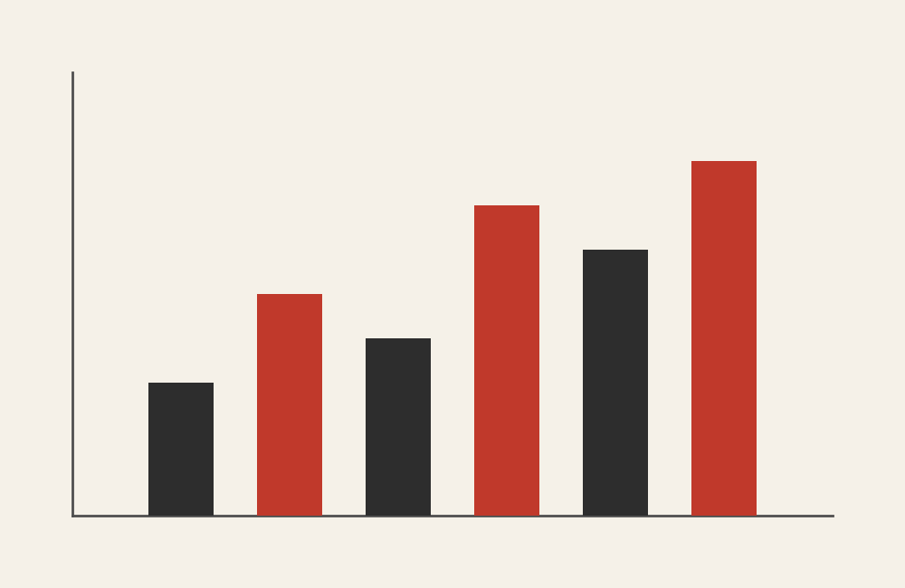
Bar Chart
Comparing values across distinct categories.
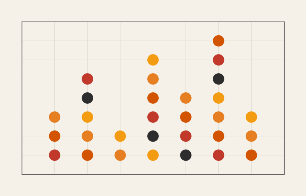
Dot Plot
Comparing categories with minimal visual clutter.
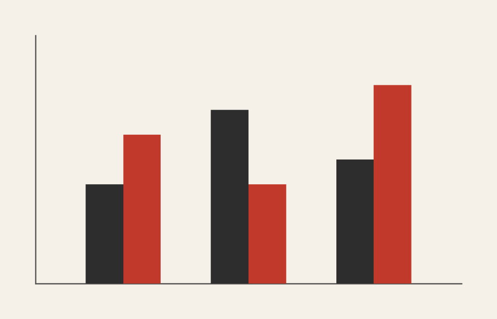
Grouped Bar Chart
Comparing sub-categories within larger categories.
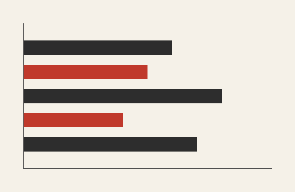
Horizontal Bar Chart
Accommodating long or numerous labels.
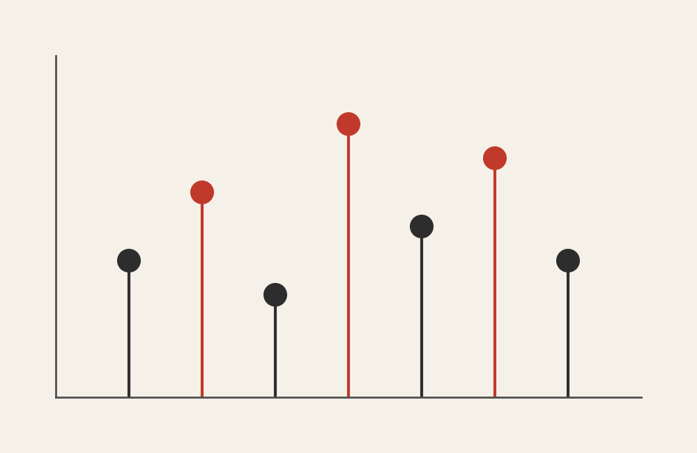
Lollipop Chart
Providing a minimalist version of a bar comparison.
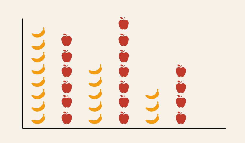
Pictogram Chart
Making comparisons more visual than numeric.
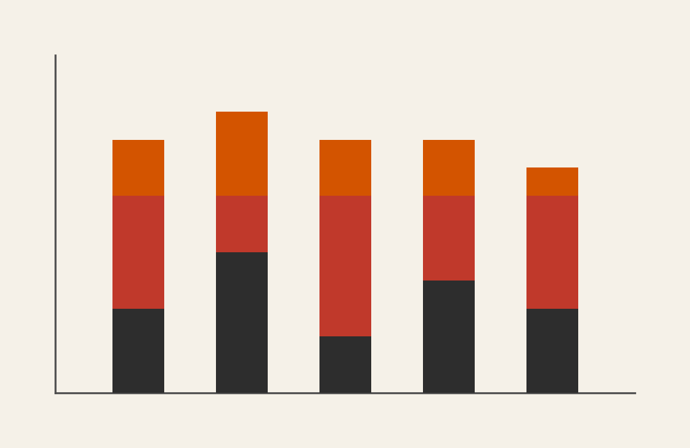
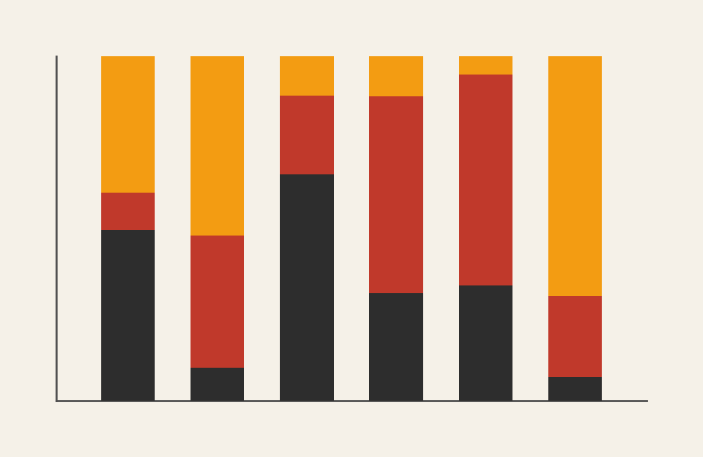
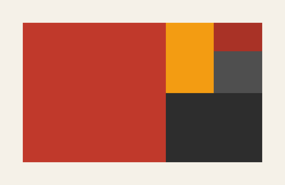
Stacked Bar Chart
Comparing totals while showing composition.
Showing Change Over Time (Trends and Sequences)
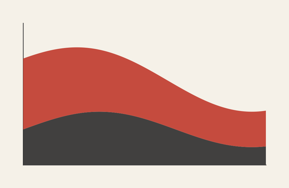
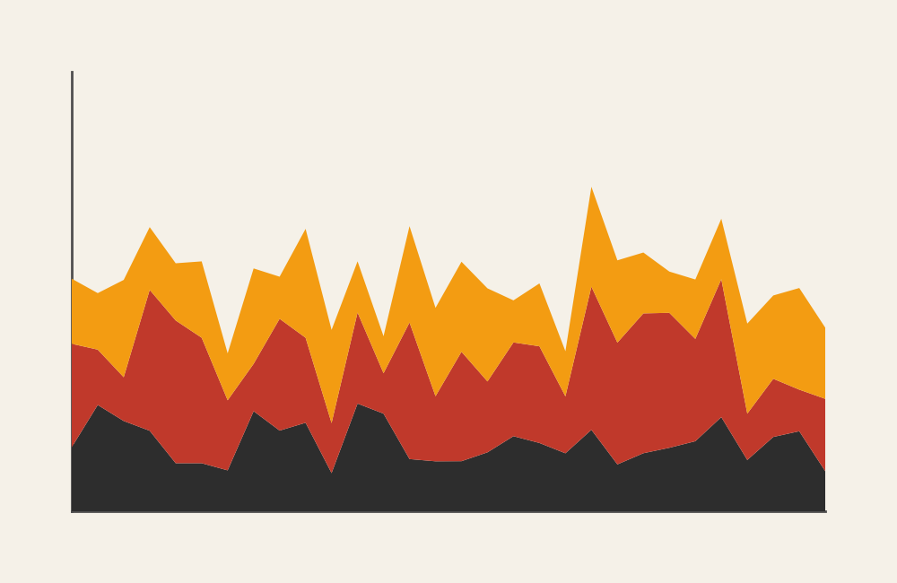
Area Graph
Emphasizing magnitude of change over time.
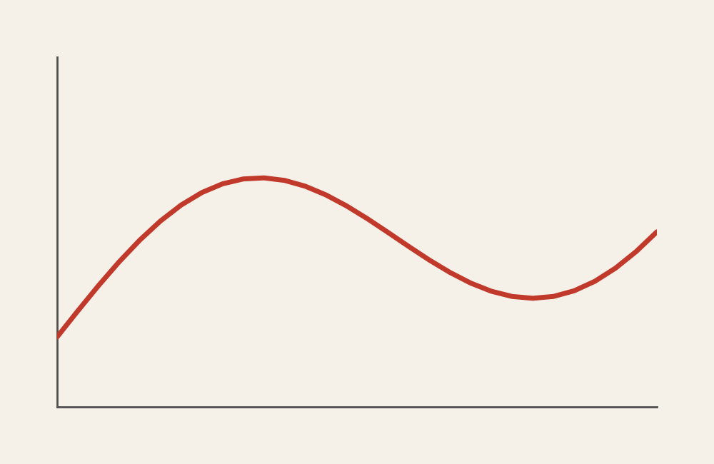
Line Graph
Showing trends across continuous time.
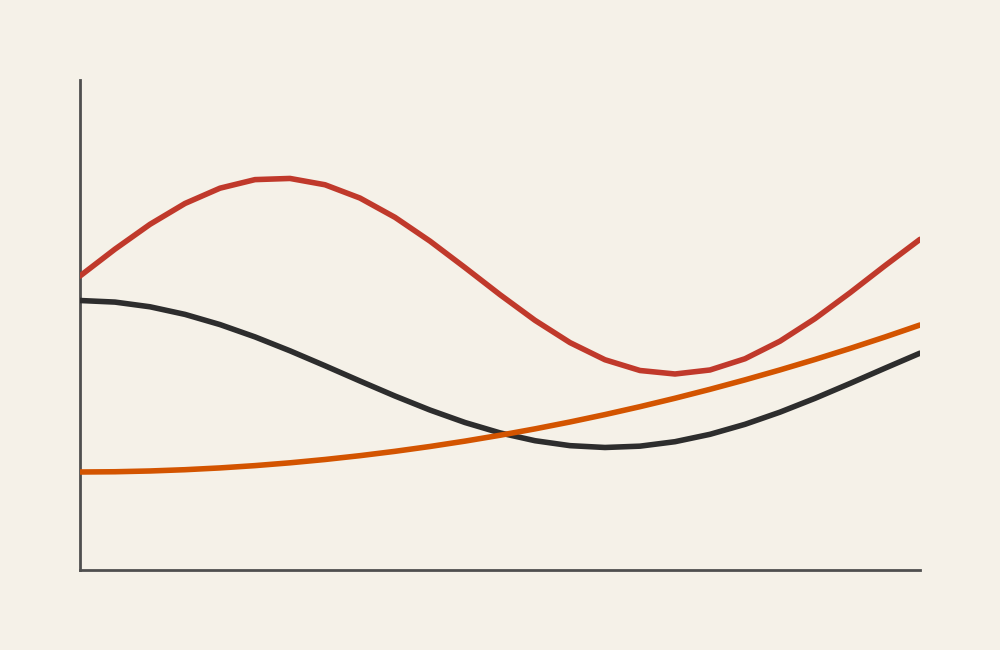
Multi-Line Chart
Comparing multiple trends over the same period.
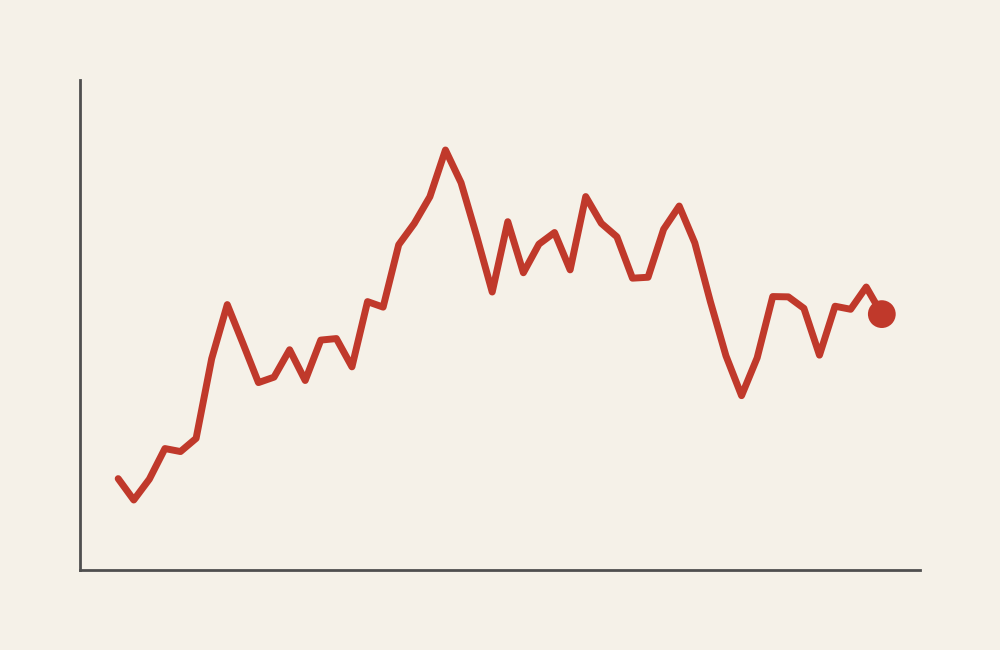
Sparkline Graph
Showing a compact trend within text or tables.
Stacked Area Graph
Showing how parts contribute to a whole over time.
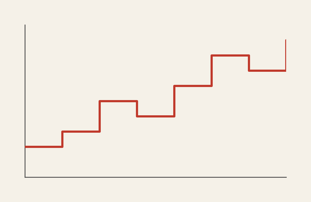
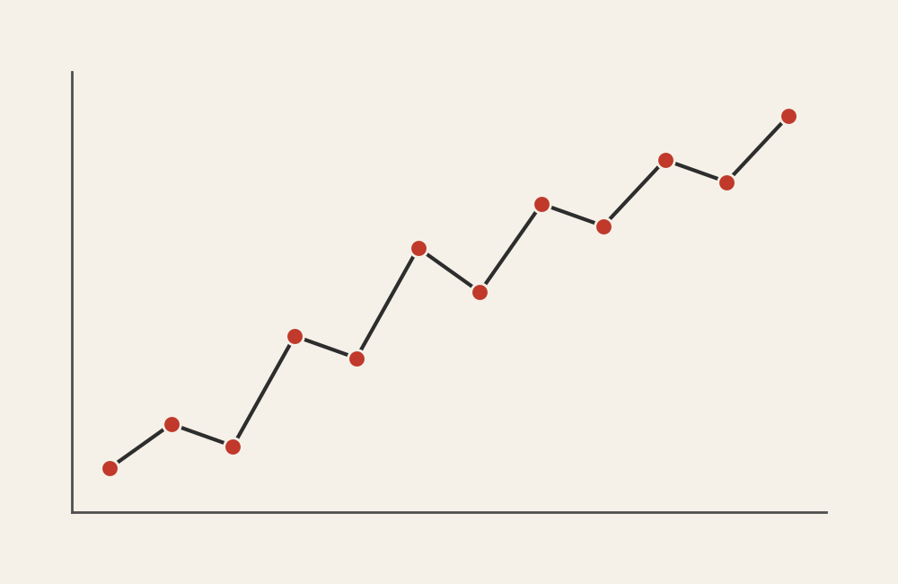
Step Line Chart
Showing changes at specific intervals.
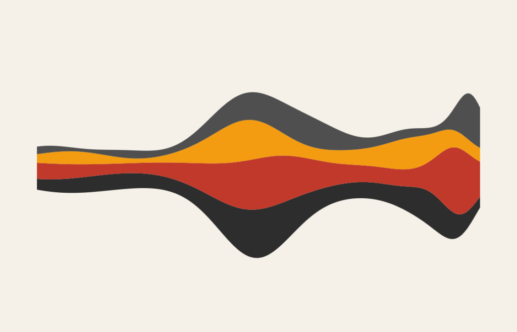
Streamgraph
Emphasizing the flow and shape of multiple trends.
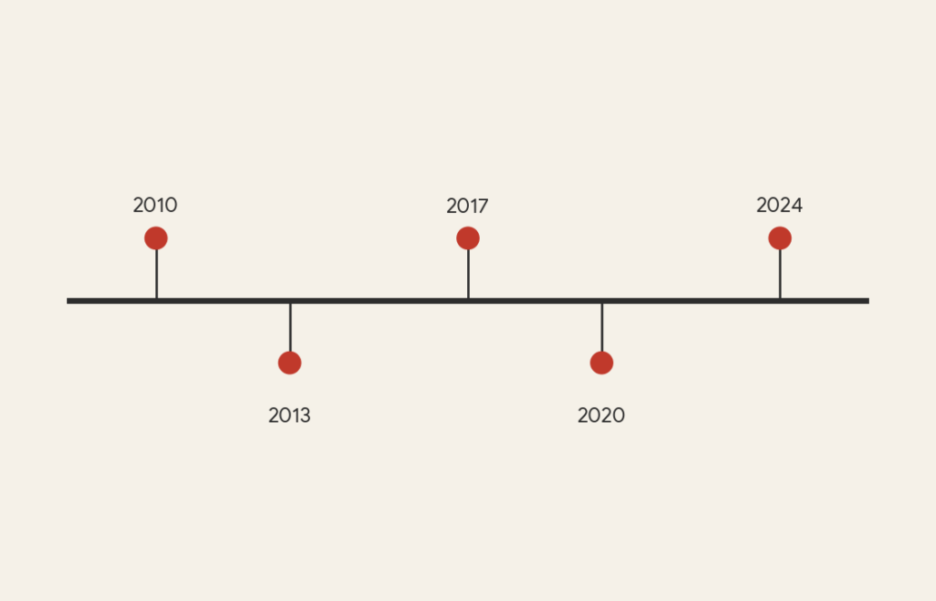
Timeline
Sequencing events chronologically.
Showing Parts of a Whole (Proportion and Composition)
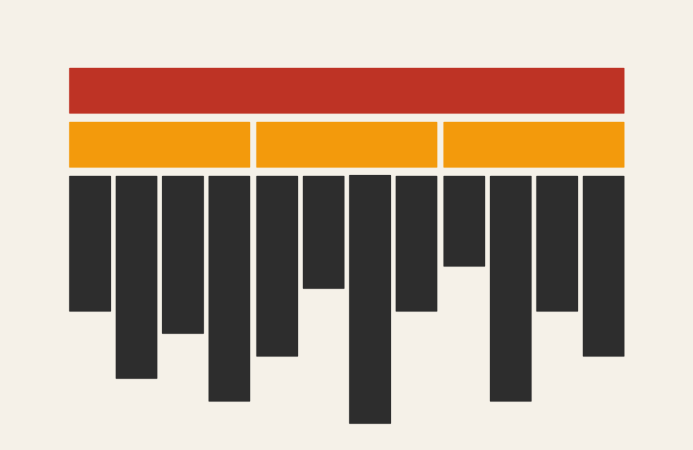
100% Stacked Bar Chart
Comparing proportional breakdowns across categories.
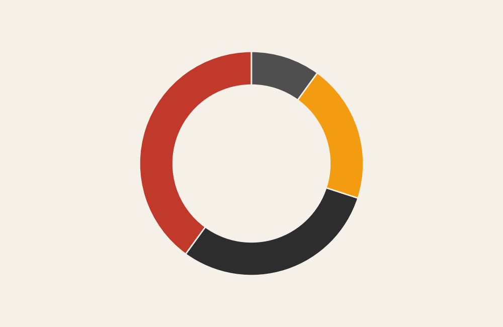
Donut Graph
Showing proportions with a central emphasis.
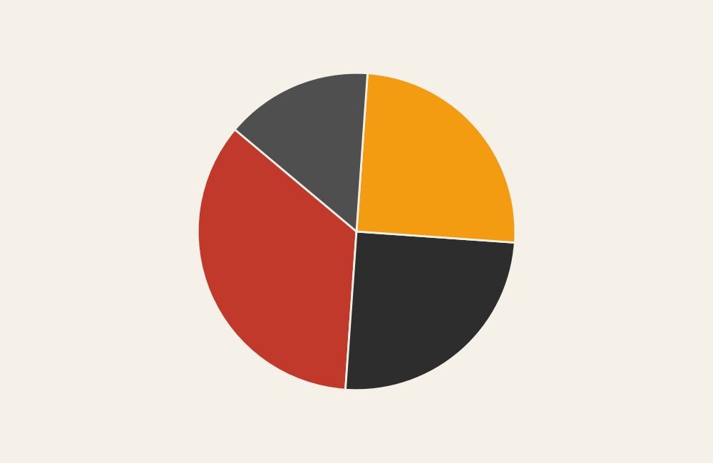
Pie Chart
Showing simple proportions with few categories.
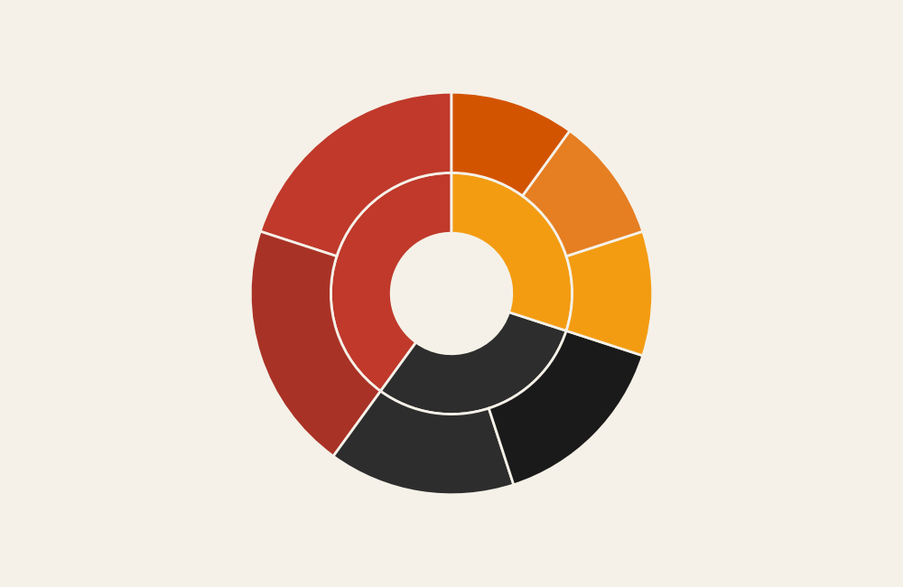
Sunburst Chart
Showing hierarchical proportions in layers.
Treemap
Showing hierarchical parts of a whole with nested areas.
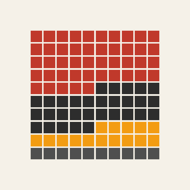
Waffle Chart
Showing proportions using a grid of units.
Showing Relationships (Correlation and Association)
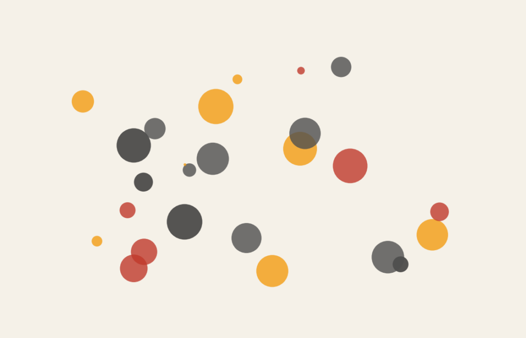
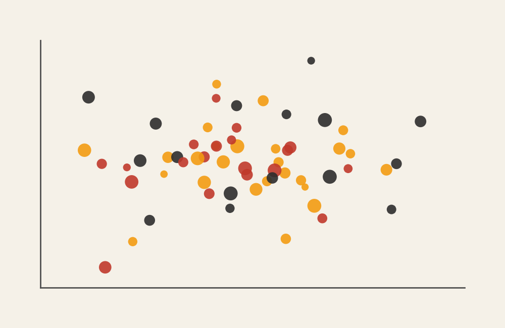
Bubble Chart
Adding a third variable to a scatter relationship.
Connected Scatter Plot
Showing movement of two variables over time.
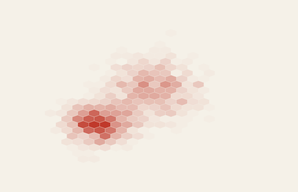
Hexbin Plot
Showing density in crowded scatter data.
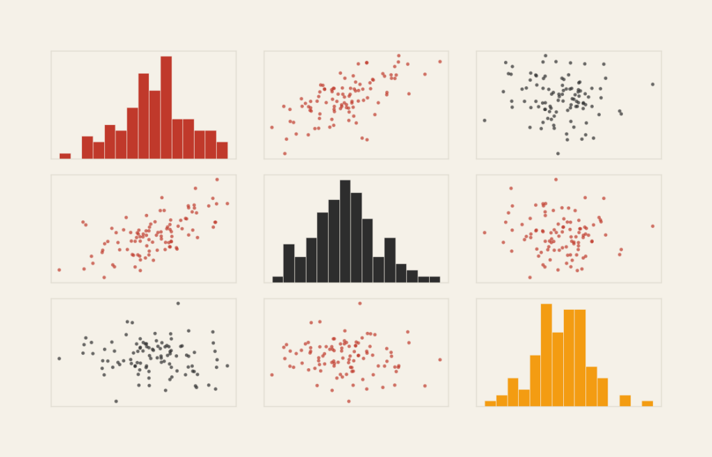
Pair Plot (Scatter Matrix)
Comparing many variable relationships at once.
Scatter Plot
Examining correlation between two variables.
Showing Distribution (Spread, Frequency, and Variability)
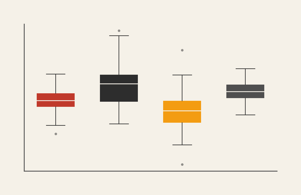
Box-and-Whister Plot
Summarizing distribution using quartiles.
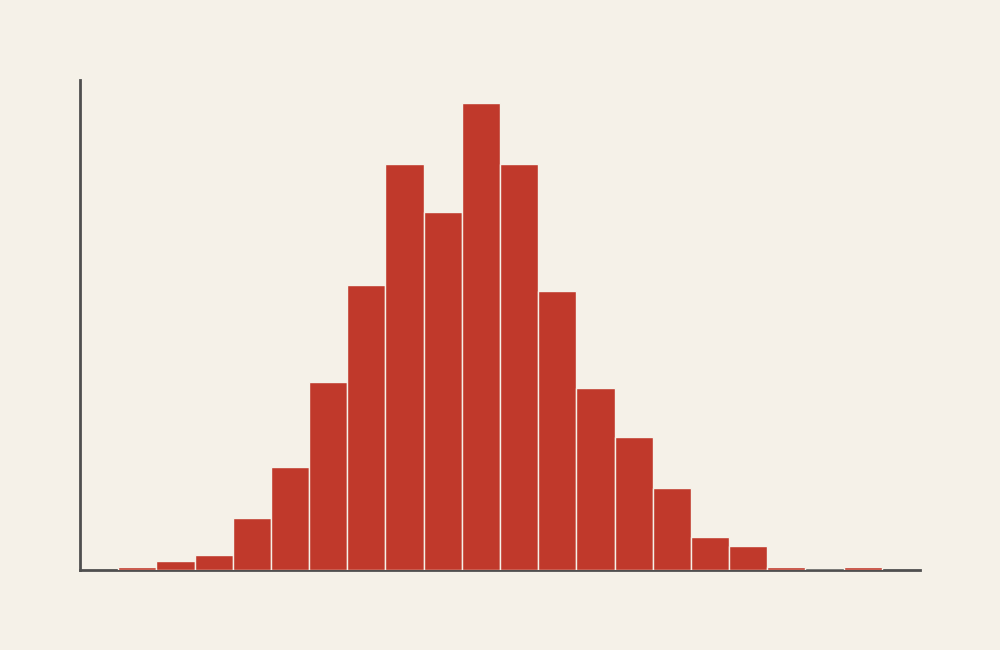
Histogram
Showing frequency distribution across value ranges.
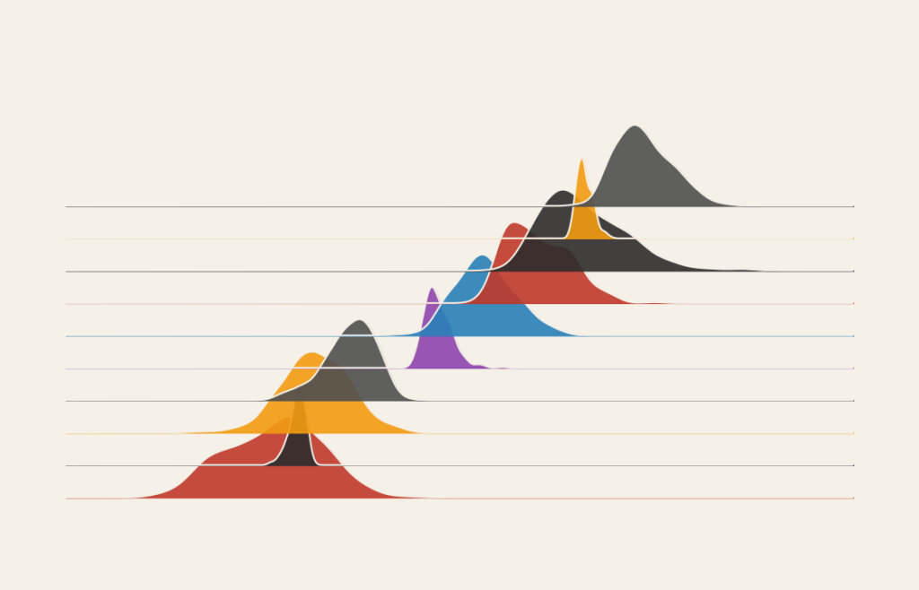
Ridgeline Plot
Comparing multiple distributions across categories.
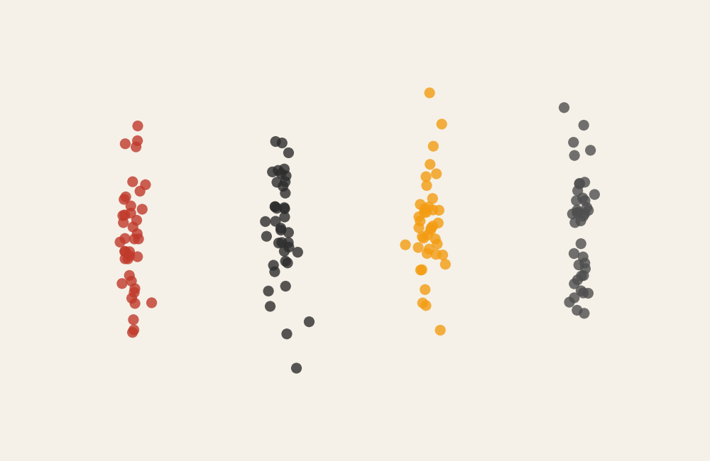
Strip Plot
Showing individual data points with slight separation.
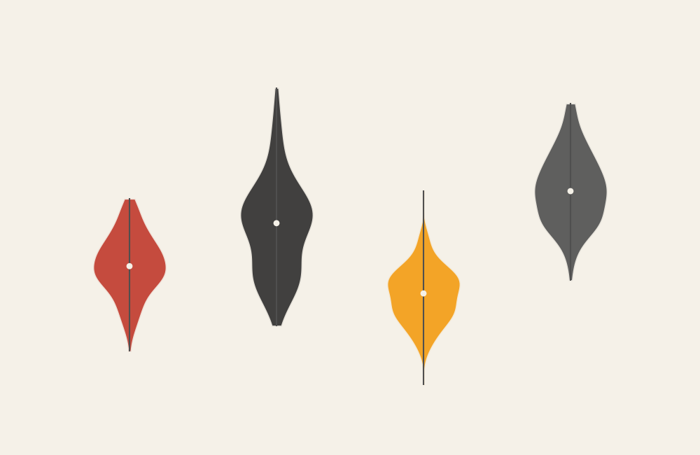
Violin Plot
Combining distribution summary with density shape.
Showing Location (Geographic & Spatial Data)
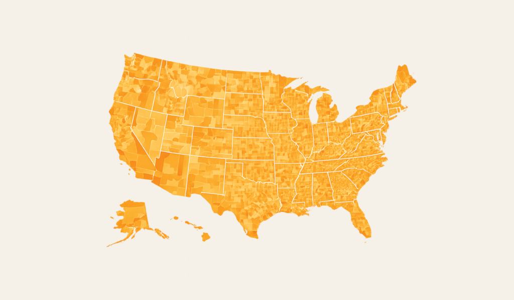
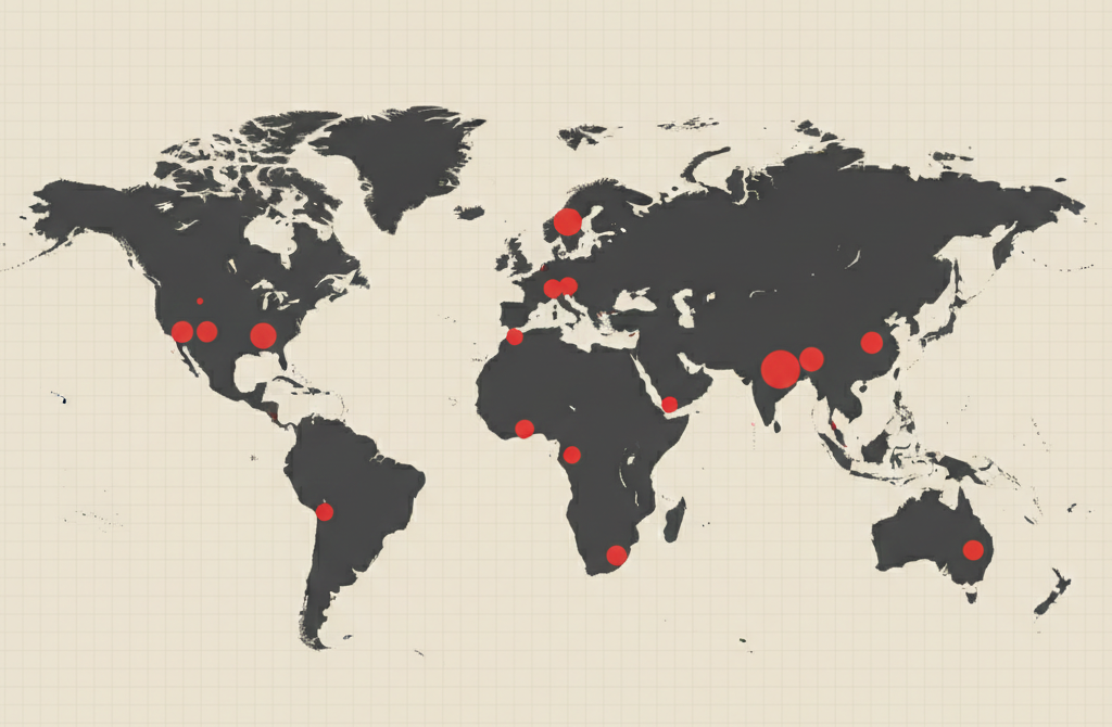
Choropleth Map
Shading regions to represent values.
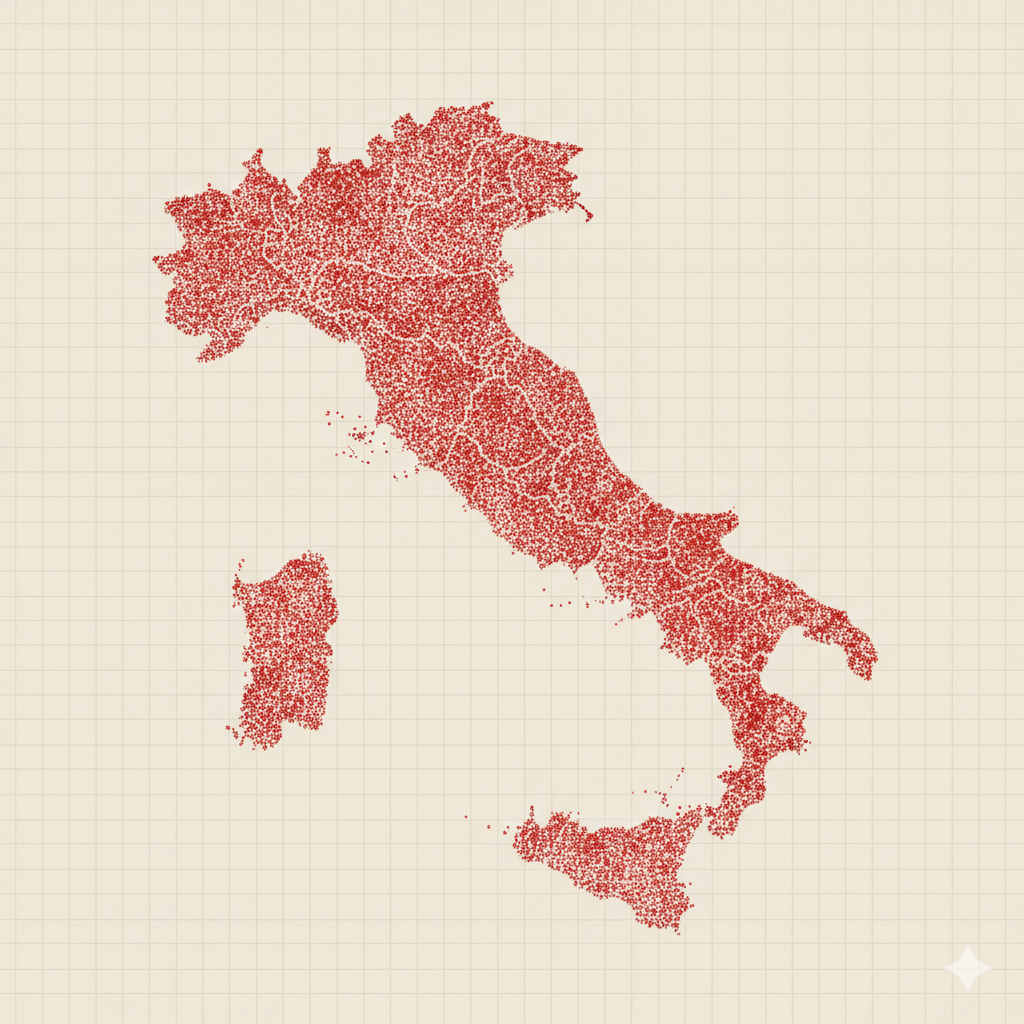
Dot Density Map
Showing geographic distribution with repeated dots.
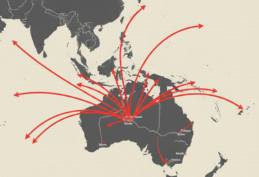
Flow Map
Mapping movement between locations.
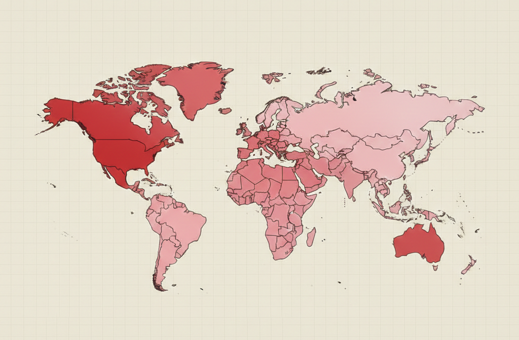
Geographic Heat Map
Showing intensity across geographic space.
Proportional Symbol Map
Sizing symbols on a map by magnitude.
Showing Hierarchy (Levels & Structure)
Icicle Chart
Showing hierarchical levels as stacked segments.
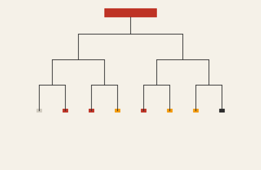
Organizational Chart
Showing formal role structure.
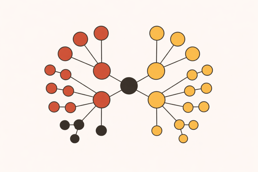
Radial Tree Diagram
Showing hierarchy in a circular layout.
Showing Flow and Process (Movement, Steps, and Systems)
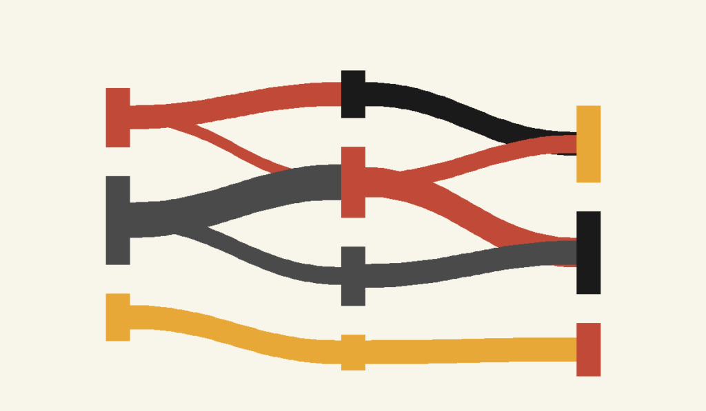
Alluvial Diagram
Tracking category changes across stages.
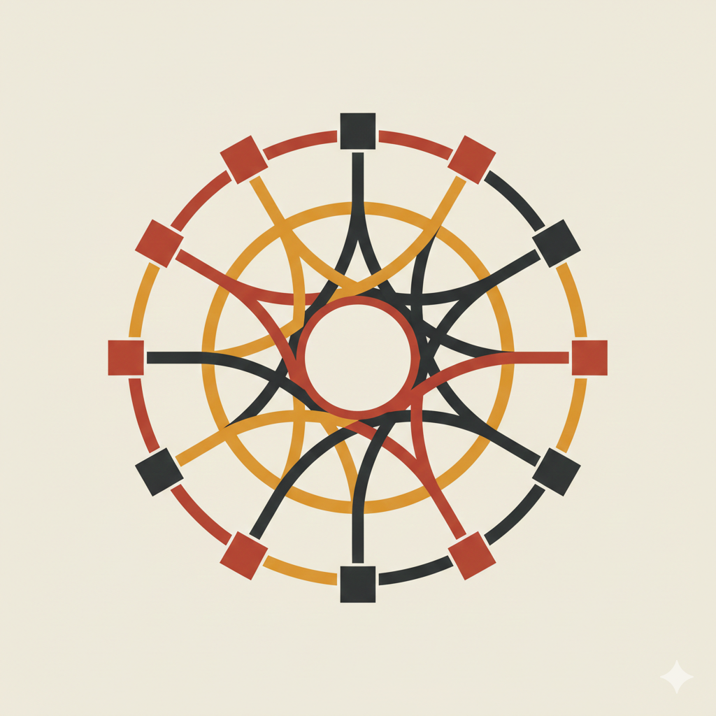
Chord Diagram
Showing interrelationships in a circular network.
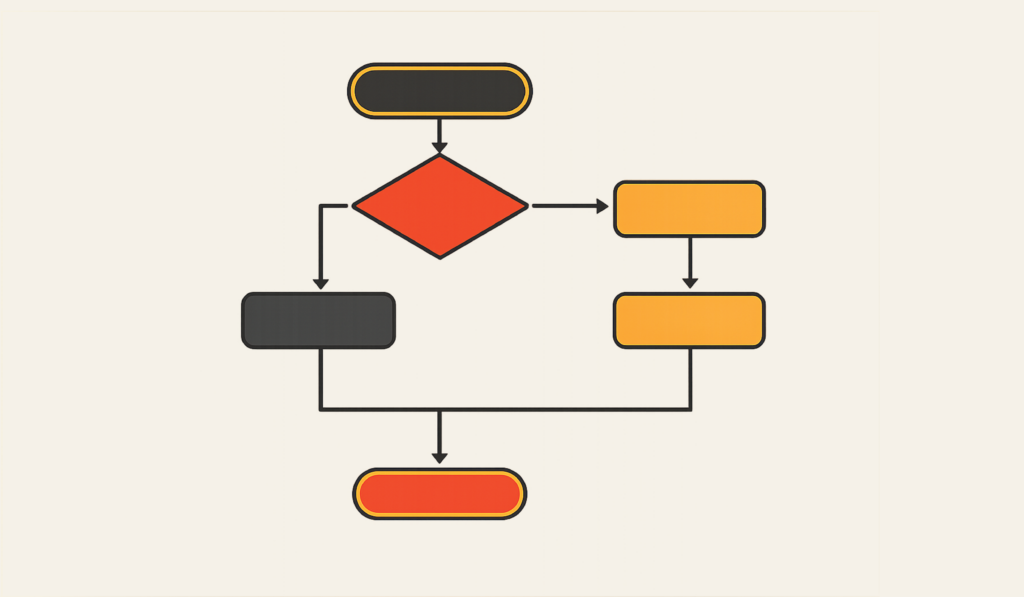
Flowchart
Showing steps in a process.
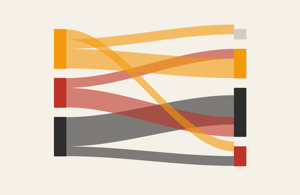
Sankey Diagram
Showing flow magnitude between stages.
Showing Rank, Magnitude, and Emphasis (Ordering & Performance)
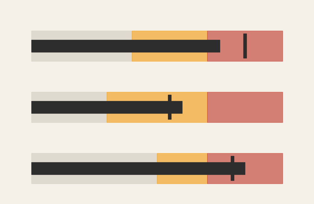
Bullet Graph
Comparing performance against a target.
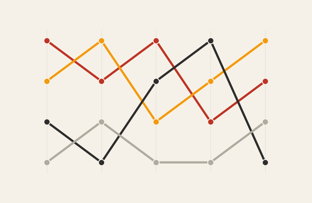
Bump Chart
Showing ranking changes over time.
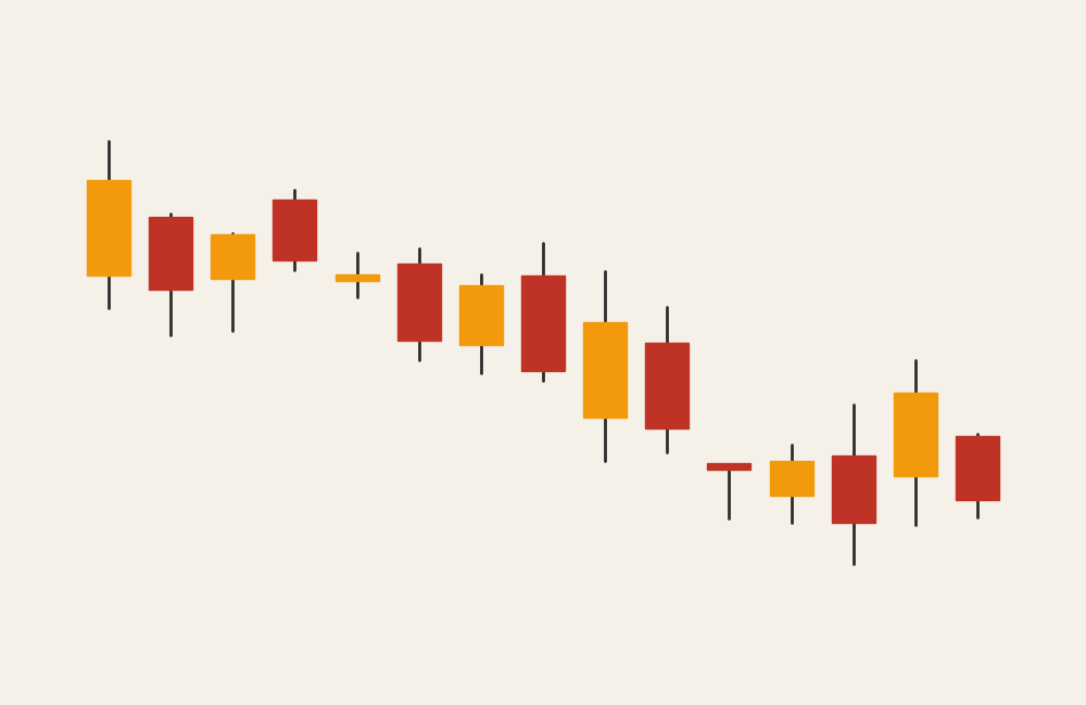
Candlestick Graph
Showing price movement over time.
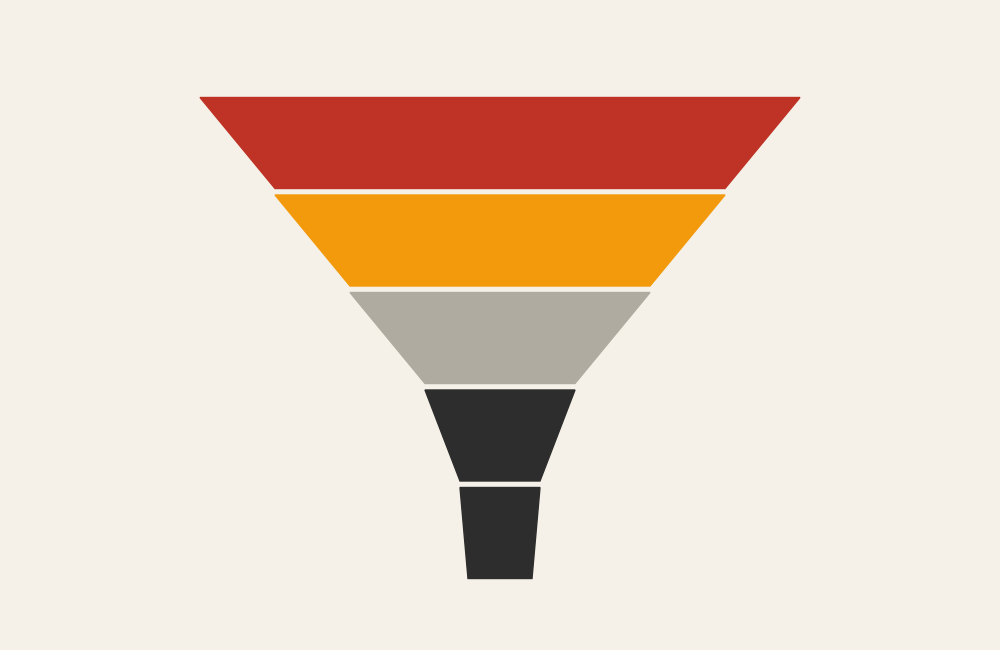
Funnel Chart
Showing stages of decreasing quantity.
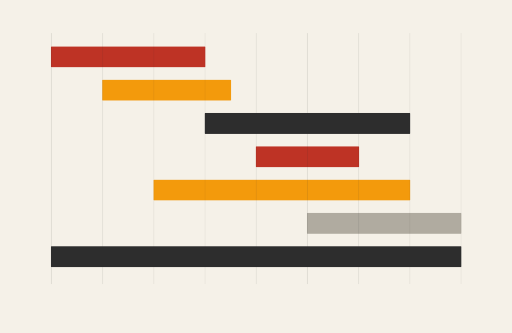
Gantt Chart
Showing project tasks across time.
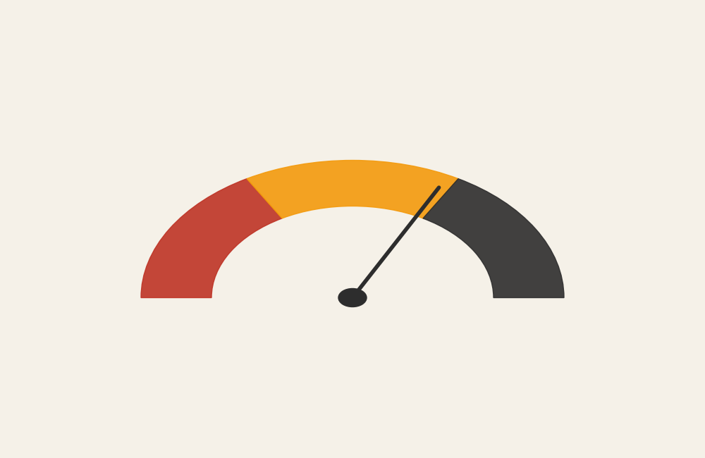
Gauge Chart
Showing a single value against a scale.
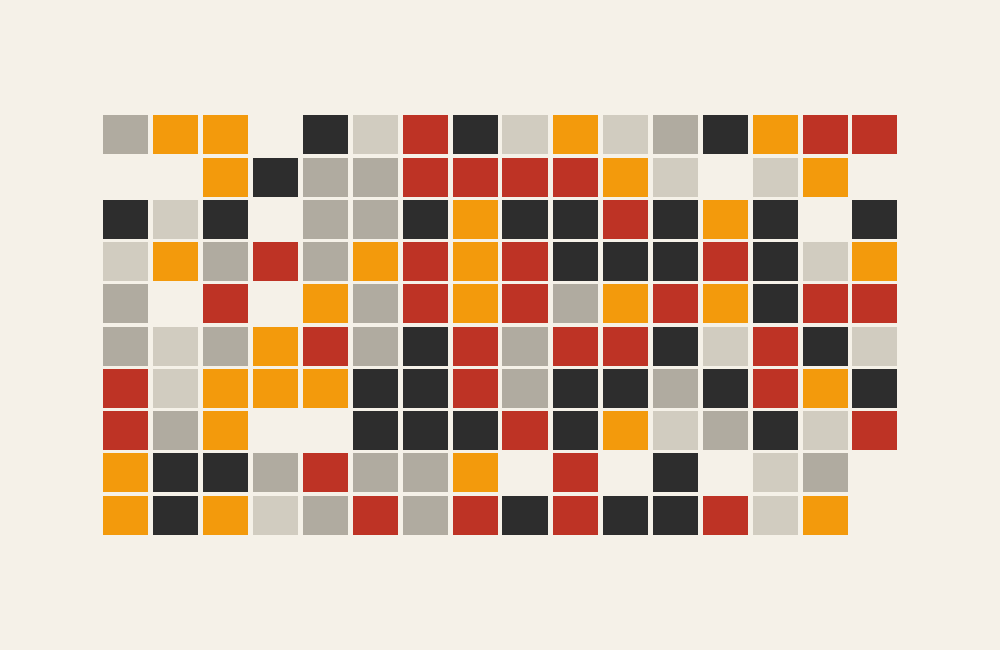
Heatmap (Matrix)
Showing intensity across two categories.
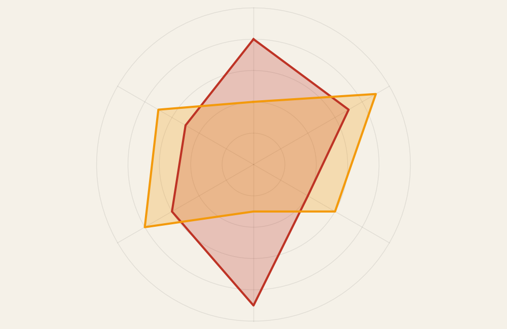
Radar (Spider) Chart
Comparing multiple variables from a center point.
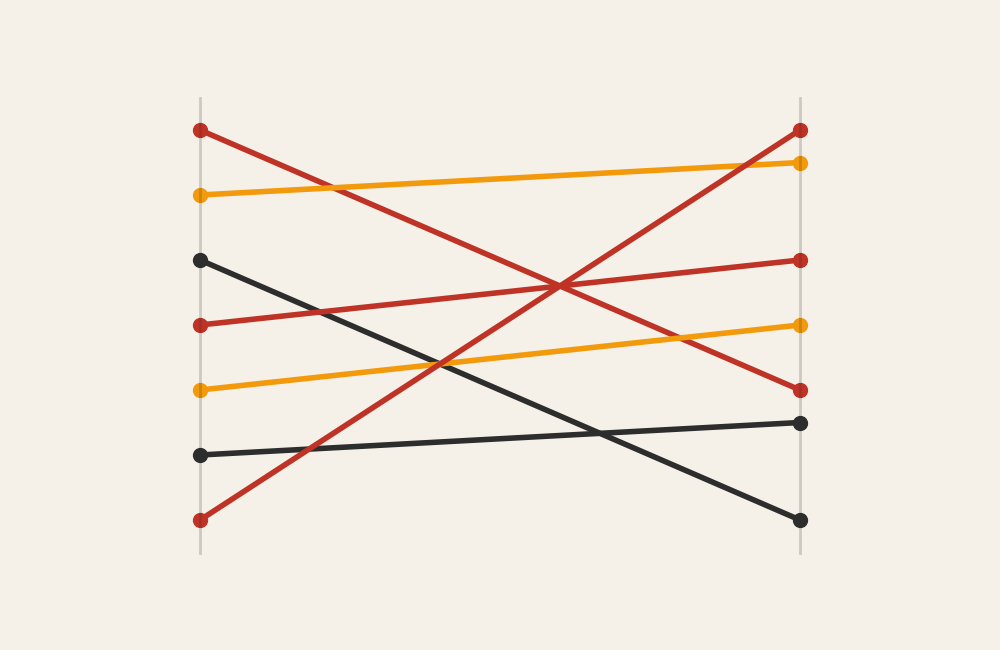
Slopegraph
Comparing change between two points.
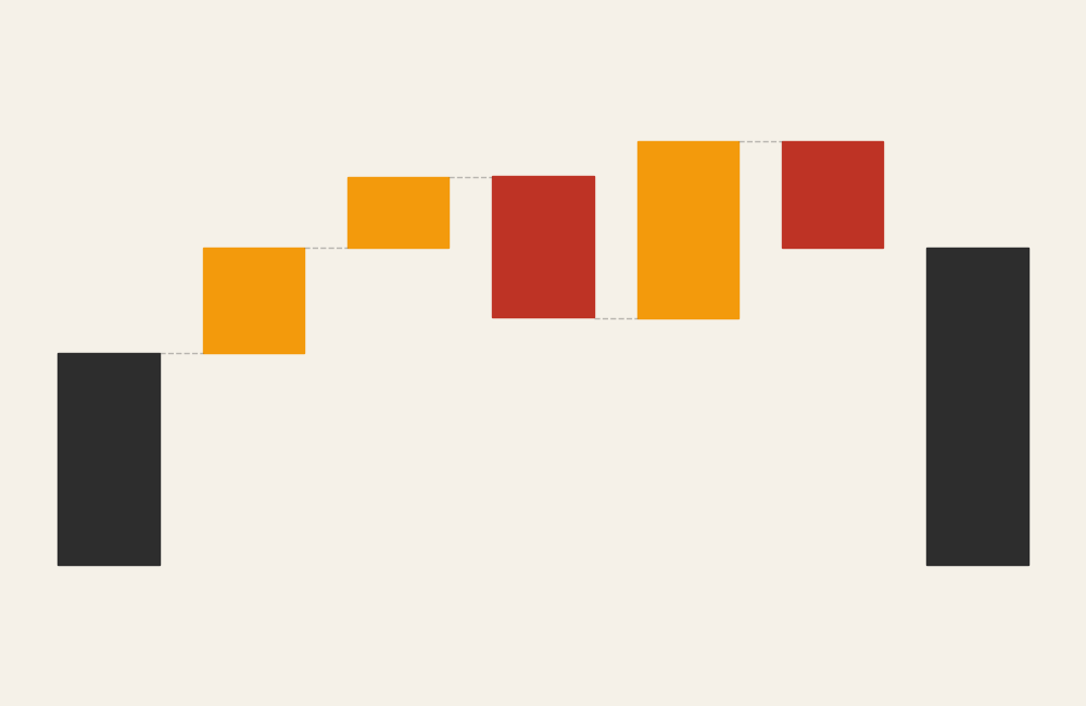
Waterfall Chart
Showing cumulative increases and decreases.
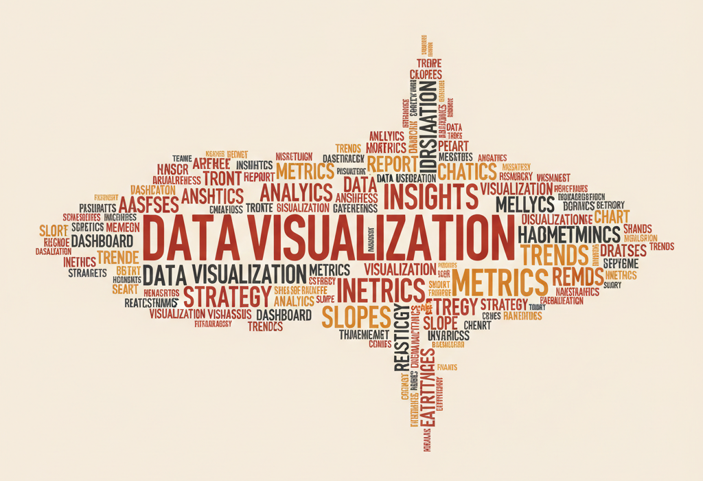
Word Cloud
Showing term frequency through size.