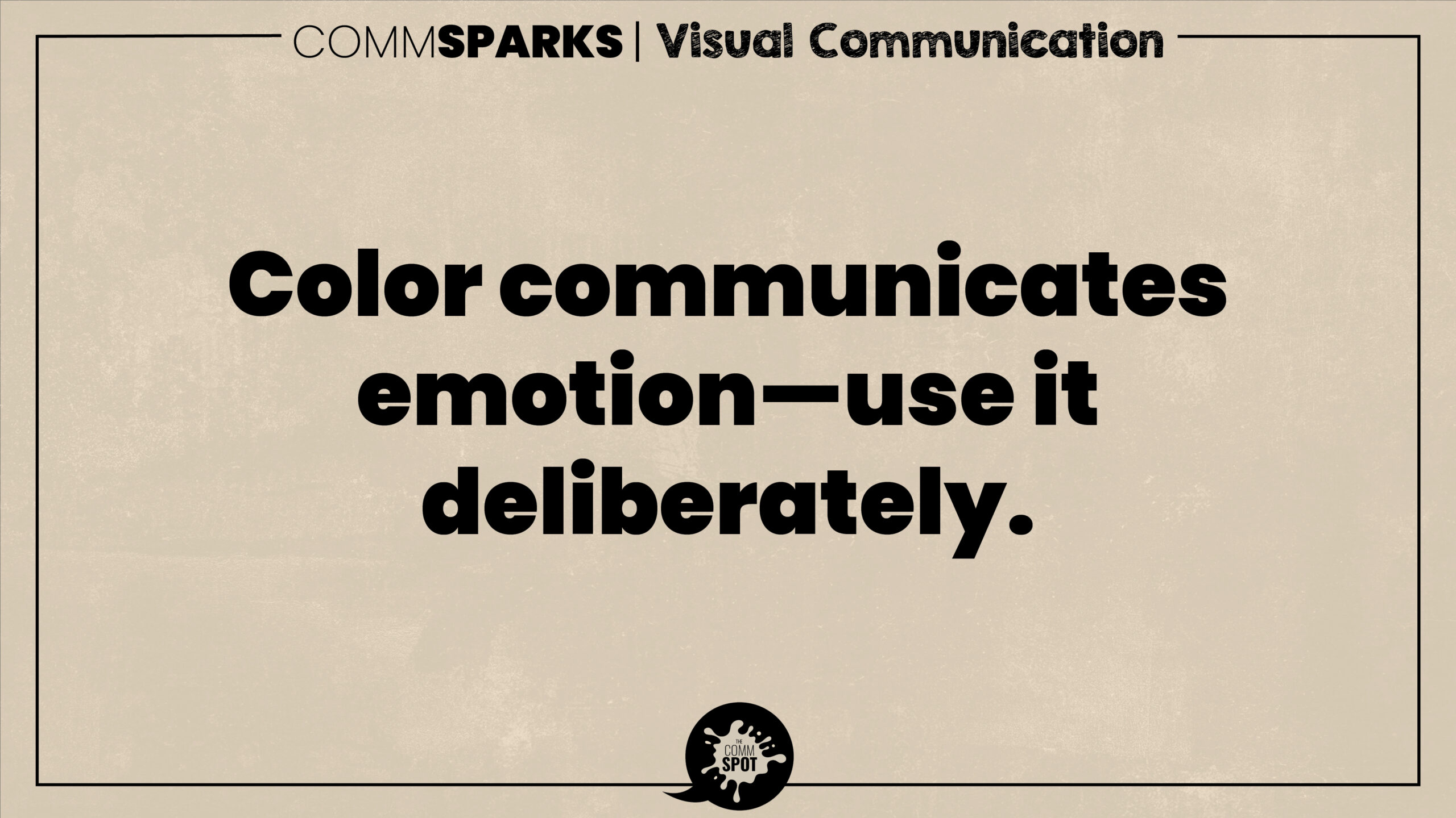
Color speaks a universal language — one that communicates mood, energy, and meaning before any words appear. That’s why great communicators and designers treat color not as ornamentation, but as strategy.
A deep blue can calm and reassure. A vibrant red can energize or warn. A muted beige can signal sophistication, while a neon green can scream innovation. Each hue carries emotional weight, influencing how your audience perceives your message, your brand, and even your credibility.
The psychology of color extends beyond aesthetics; it affects cognition and behavior. Studies show that color can increase brand recognition by up to 80% and shape decision-making within seconds. That means choosing a palette isn’t a design afterthought — it’s a communication choice.
When selecting colors, consider your message’s emotional goal. Do you want to inspire confidence, spark excitement, or build trust? Your color choices should reinforce that outcome. And consistency matters — when your brand’s colors are cohesive across platforms, your identity becomes memorable and trustworthy.
In short: color is silent but powerful. It’s the emotional soundtrack behind your message. So next time you design a slide deck, campaign, or infographic, ask yourself not just how it looks, but how it feels.
Because in communication, color isn’t just visual — it’s visceral.