
Introduction to Visual Analysis
Visual analysis is a method of studying the visual components of any material object or visual representation, such as paintings, advertisements, digital media, statues and physical works of art, or even performances, to interpret its meaning and impact. It involves a detailed examination of the elements like color, form, line, shape, space, texture, and typography and considers how these elements work together to convey specific messages or effects. The analysis helps to uncover the underlying themes, the effectiveness of visual communication, and the cultural and social context represented.
How Visual Analysis is Used in Communication
Marketing and Advertising:
- Visual analysis is crucial in marketing and advertising to determine how effectively visual elements attract attention, convey messages, and persuade consumers. Analyzing visuals helps marketers understand how colors, imagery, and design layouts impact consumer perception and behavior.
Media Studies:
- In media studies, visual analysis is used to explore how visuals in films, television, and online media represent cultural values, social issues, and power dynamics. It provides insights into how media shapes public opinion and societal norms through visual storytelling.
Corporate Communication:
- For corporate communication, visual analysis can assess the effectiveness of visual elements in annual reports, presentations, and internal communications. It ensures that visual aids enhance understanding and engagement rather than distract or mislead.
How to Conduct a Visual Analysis
Step 1: Select the Visual Artifact
Choice of Subject:
- Choose the visual artifact you want to analyze. It could be a digital image, a printed advertisement, a page from a website, or any other form of visual media.
Step 2: Describe the Artifact
Initial Observations:
- Start by making detailed observations about the visual. Note everything you see, including the layout, colors, people, objects, texts, and any other elements present.
Step 3: Contextualize the Visual
Background Information:
- Gather background information about the visual artifact. This may include the creator’s background, the historical period, the purpose of the work, and its original context.
Step 4: Analyze Design Elements
Detailed Analysis of Components:
- Analyze the specific components of the visual:
- Color: What colors are used? What emotions or ideas might these colors evoke?
- Line and Shape: How do lines and shapes direct the viewer’s attention? Are there any dominant shapes?
- Typography: If text is present, how does the choice of font affect the message?
- Composition: How are elements arranged? What does this arrangement say about the focal points of the visual?
Step 5: Interpret the Significance
Thematic Analysis:
- Develop interpretations based on the elements analyzed. Consider what the visual communicates:
- What themes or messages are evident?
- How do the visual elements support these themes?
- Are there any symbols or metaphors?
- What is the intended impact on the viewer?
Step 6: Evaluate Effectiveness
Critical Evaluation:
- Critically evaluate how effectively the visual communicates its message. Consider its success in reaching its intended audience and the potential social or cultural impact.
Step 7: Write Your Analysis
Structure Your Findings:
- Write a comprehensive analysis, starting with a description, followed by detailed observations, contextual background, a discussion of the visual elements, and your interpretations.
Conclusion:
- Conclude with a summary of your findings and the implications of your analysis. Reflect on any insights gained about visual communication.
Step 8: Cite Sources
Referencing:
- Ensure to cite any sources used in your research to back up your observations and interpretations.
Example Visual Analysis (Simplified)
Below is a simplified version of a visual analysis of the iconic advertisement, “Think Small” by Volkswagen, created by the Doyle Dane Bernbach (DDB) agency in 1959. This campaign marked a turning point in advertising and is widely studied for its innovative approach.
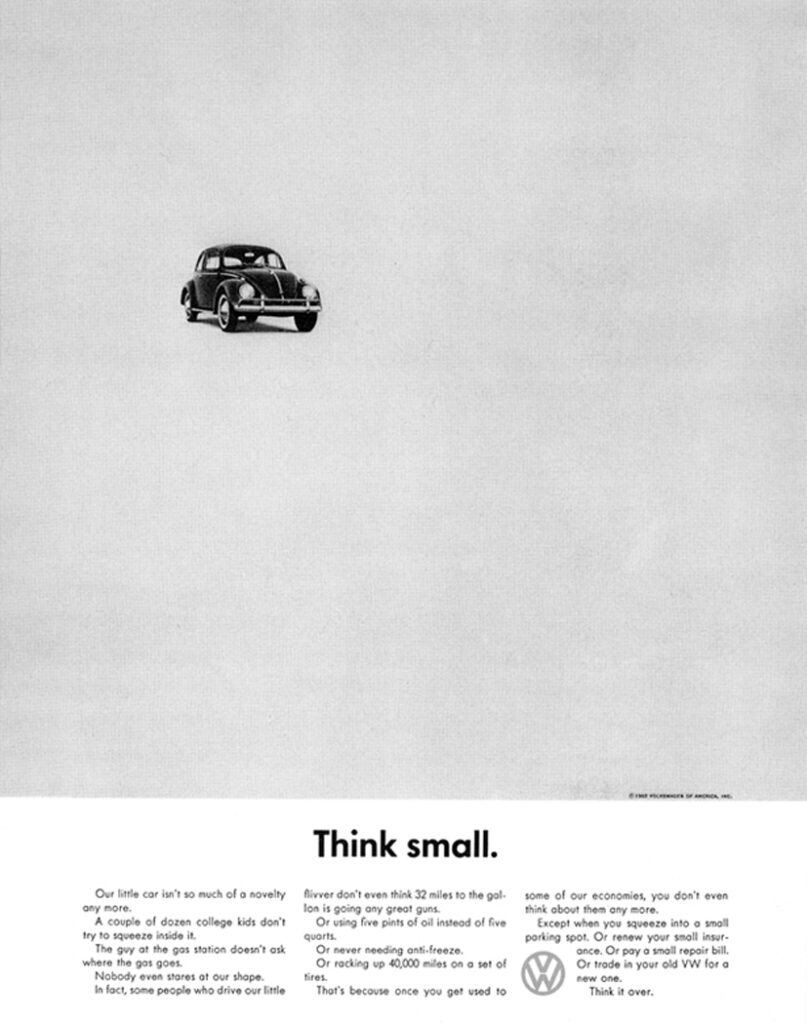
Visual Analysis of “Think Small” Volkswagen Advertisement
Description of the Advertisement
The “Think Small” ad features a plain, white background with a small Volkswagen Beetle placed slightly off-center towards the top of the page. The car is photographed from a high angle, making it appear even smaller against the expansive white space. Below the image of the car, centered text in a simple, sans-serif font spells out “Think Small.”
Contextual Background
In the late 1950s, American cars were often marketed for their size, power, and luxury, with advertisements emphasizing more extravagant lifestyles. In stark contrast, Volkswagen introduced the Beetle to the American market with an ad campaign that celebrated its simplicity, economy, and practicality. This approach was revolutionary at the time, as it went against the prevailing trends of automotive marketing.
Analysis of Design Elements
- Color and Space: The use of a vast white space with a small image of the Beetle instantly draws the viewer’s attention to the car, emphasizing the message of simplicity and minimalism. The black and white color scheme adds to the stark, unembellished message.
- Typography: The choice of a clean, modern sans-serif font for the text “Think Small” reinforces the message of simplicity and modernity. The text is humble yet bold in its straightforwardness, effectively communicating the core message without distraction.
- Composition: The high angle of the car photograph, along with its placement in the upper part of the layout, leaves a lot of empty space below, which serves to make the car seem even smaller. This unusual composition breaks from traditional car ads that typically place the car prominently in the center, filling much of the space.
Interpretation of Significance
- Themes and Messages: The central theme of the advertisement is the celebration of modesty and practicality in a time of excess. It suggests that bigger isn’t always better, a message that resonated with many during the economic conditions of the time. The ad flips the typical consumerist message on its head, promoting the idea that small can be a virtue, especially when it comes to efficiency and economy.
- Symbols and Metaphors: The Volkswagen Beetle itself becomes a symbol of non-conformity and a minimalist lifestyle. It stands in contrast to the prevailing American values of the late 1950s, which equated bigger with better. The simplicity of the design and message symbolizes a shift towards more practical and authentic communication in advertising.
Evaluation of Effectiveness
- Impact on Viewers: The ad was highly effective in making viewers rethink their values when it came to automobiles. It was distinctive enough to capture attention and memorable in its simplicity, helping Volkswagen establish a strong foothold in the American market.
- Cultural Impact: The “Think Small” ad is credited with being one of the first examples of modern advertising. It challenged the norms of its time, influencing not only automotive marketing but also the overall approach to advertising in the decades that followed.
Conclusion
The “Think Small” Volkswagen advertisement is a landmark in advertising history. Its innovative use of simplicity, both visually and textually, effectively communicated a counter-cultural message that appealed to consumers’ growing desire for practicality and authenticity. This visual analysis highlights how thoughtful design and clear messaging can profoundly impact viewer perception and cultural trends.
*Content on this page was curated and edited by expert humans with the creative assistance of AI.